



In design, the transitions between surfaces are everything. And in a perfect world, those surfaces are designed at the same time, giving the designer the luxury of thinking things through.
Sometimes, however, things need to be retrofit. And then it’s up to someone who may not have any design training at all to come up with a coping solution. What do you think of these four executions:
1
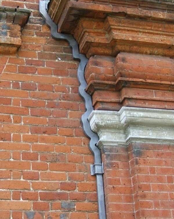
2
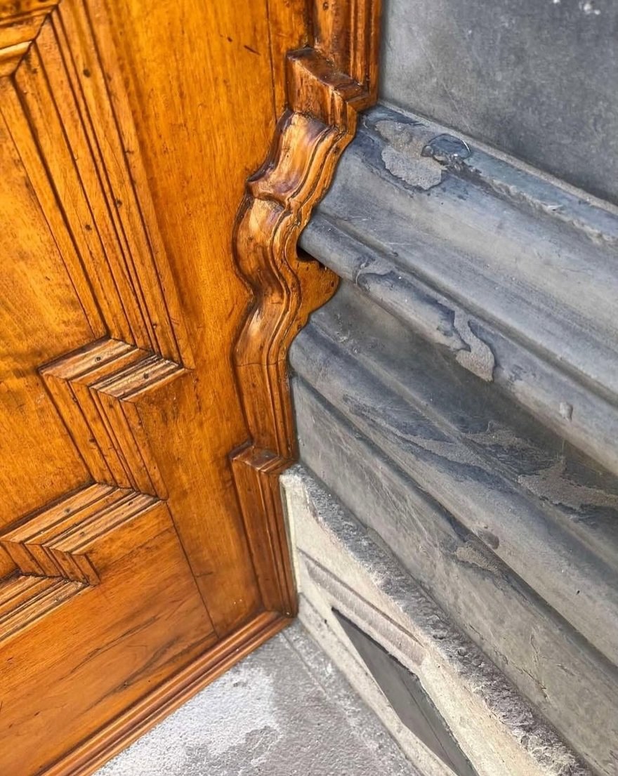
3
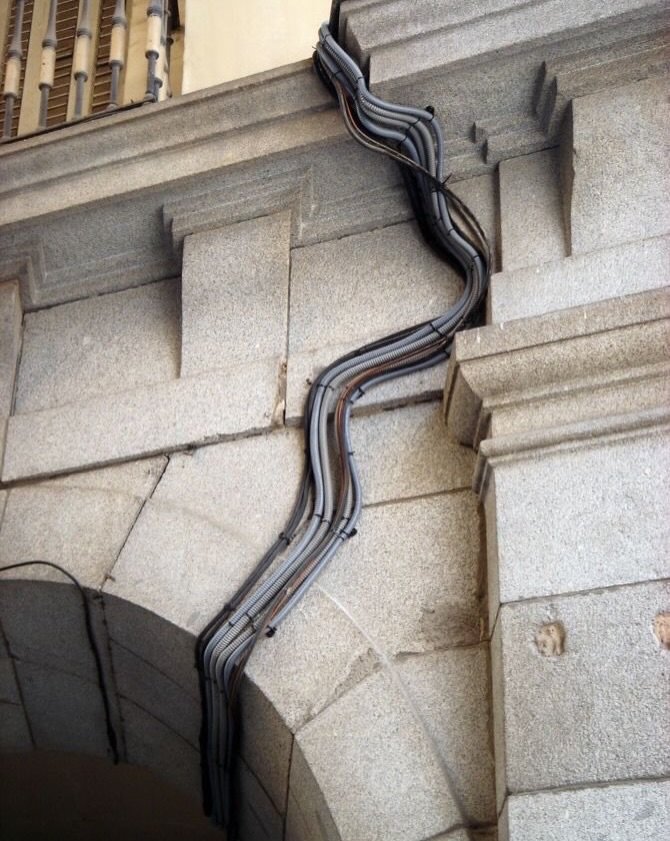
4
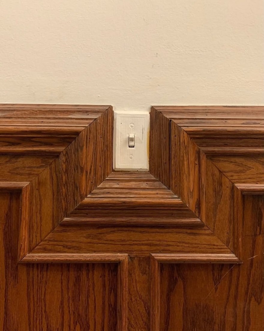
My opinions:
1. Way too busy, and distracts from the original molding, which is meant to be a design feature; downspouts are not. I think they’d have been better off letting a downspout be a downspout,
2. Ditto. A decision should have been made here—you can’t have it both ways. One of the materials has to be prioritized over the other, and I think the stone should’ve been the winner, given its material properties.
3. Admittedly this person was given an impossible task, as the wiring cannot protrude from the surfaces for code compliance. I can forgive this one because at least they didn’t try to get cute with it; ugly as it is, this is actually form follows function.
4. I think this is the worst of the lot. The switchplate and stile aren’t communicating with one another, and the width of the mitered molding draws way too much attention, treating the switch as if it’s something to be celebrated. It would’ve been worth the extra foot of wiring to move the switch above the molding.
Your thoughts/solutions?
Source: Design Criticism: Are These Transitions Good or Bad?